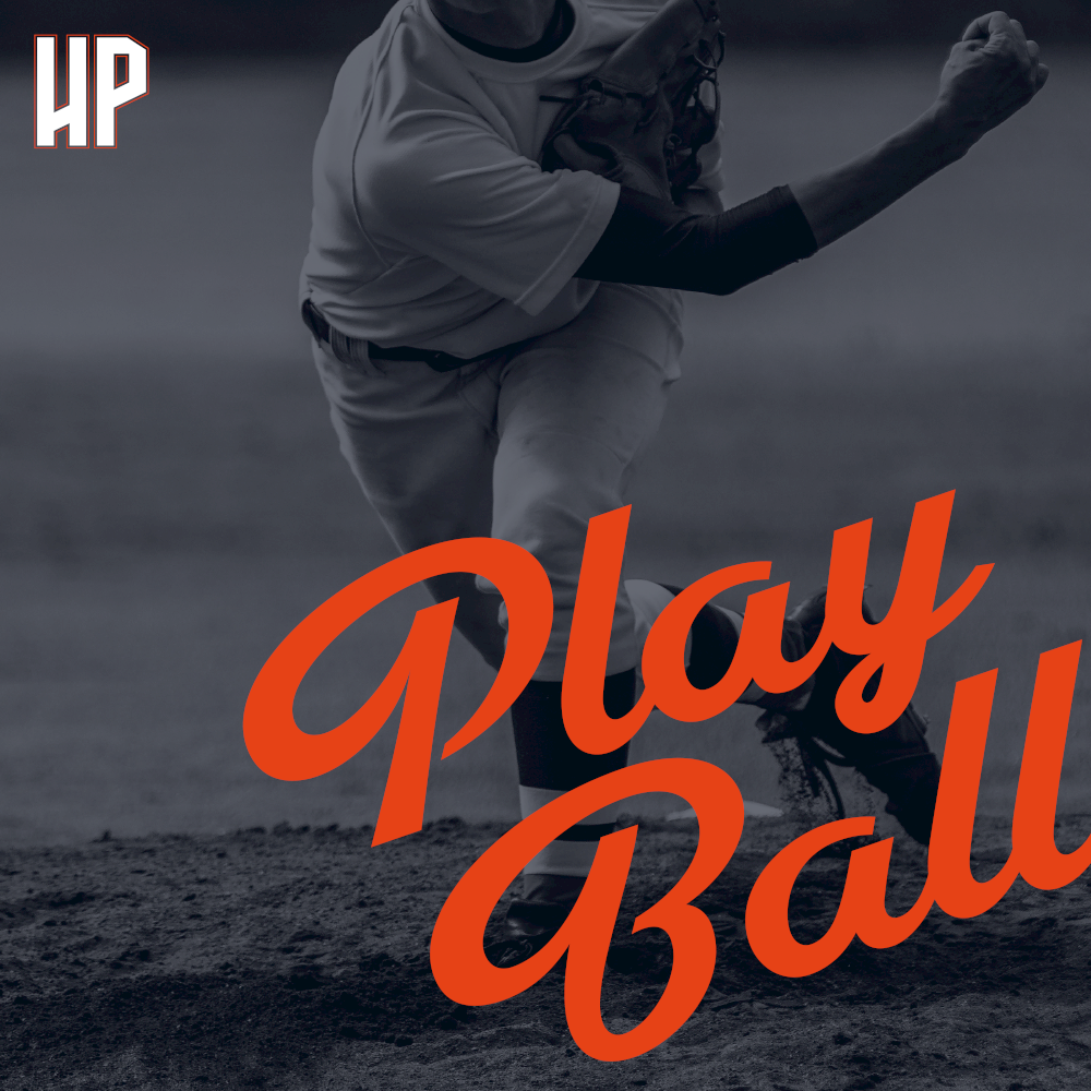
High Park Little League launched an exciting new look that will be featured in an exciting range of spirit gear that will soon be available.
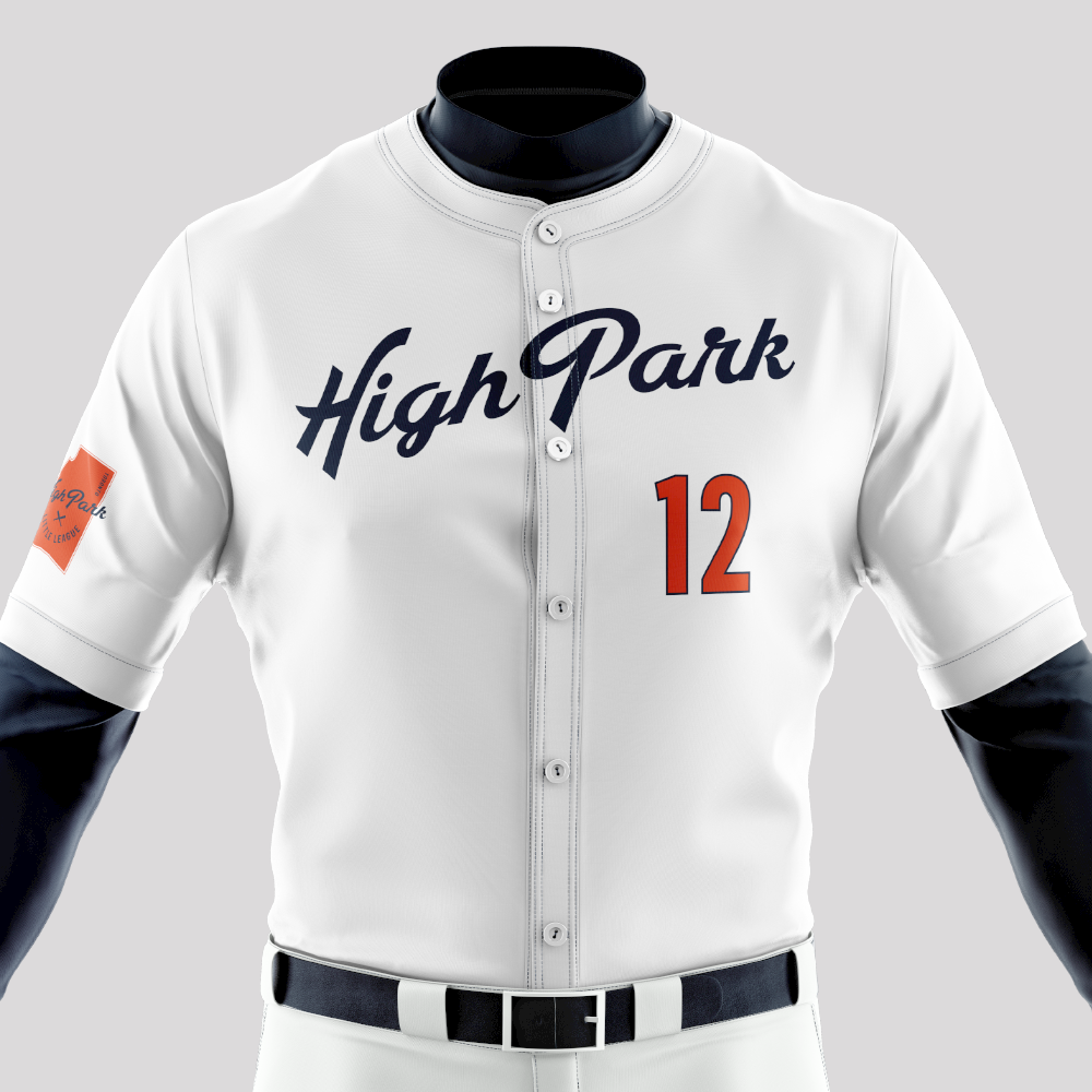
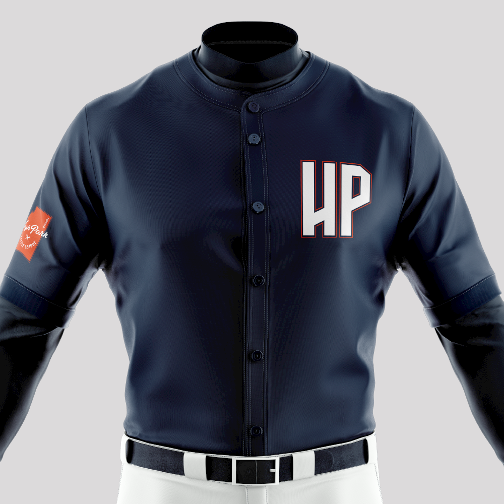
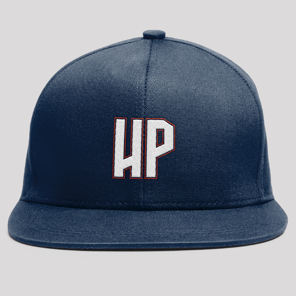
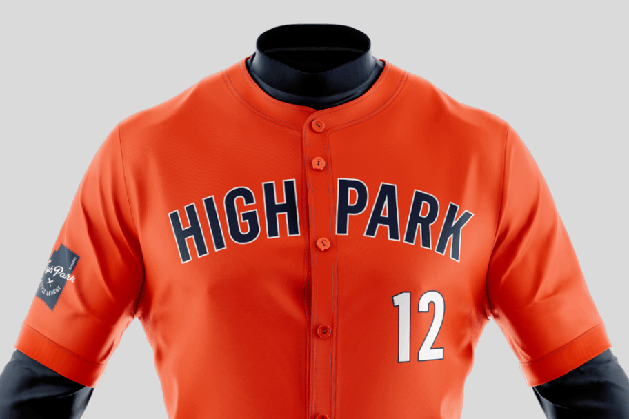
Working in conjunction with Toronto-based creative agency trevor//peter, the club has created a new visual identity for its its rep uniforms, park signage, web and social media presence.
The uniqueness of the 400-acre park itself informed the final design, which was set in motion in 2017 when the club decided to move away from the name “Braves” out of respect for the rich Indigenous history of the area.
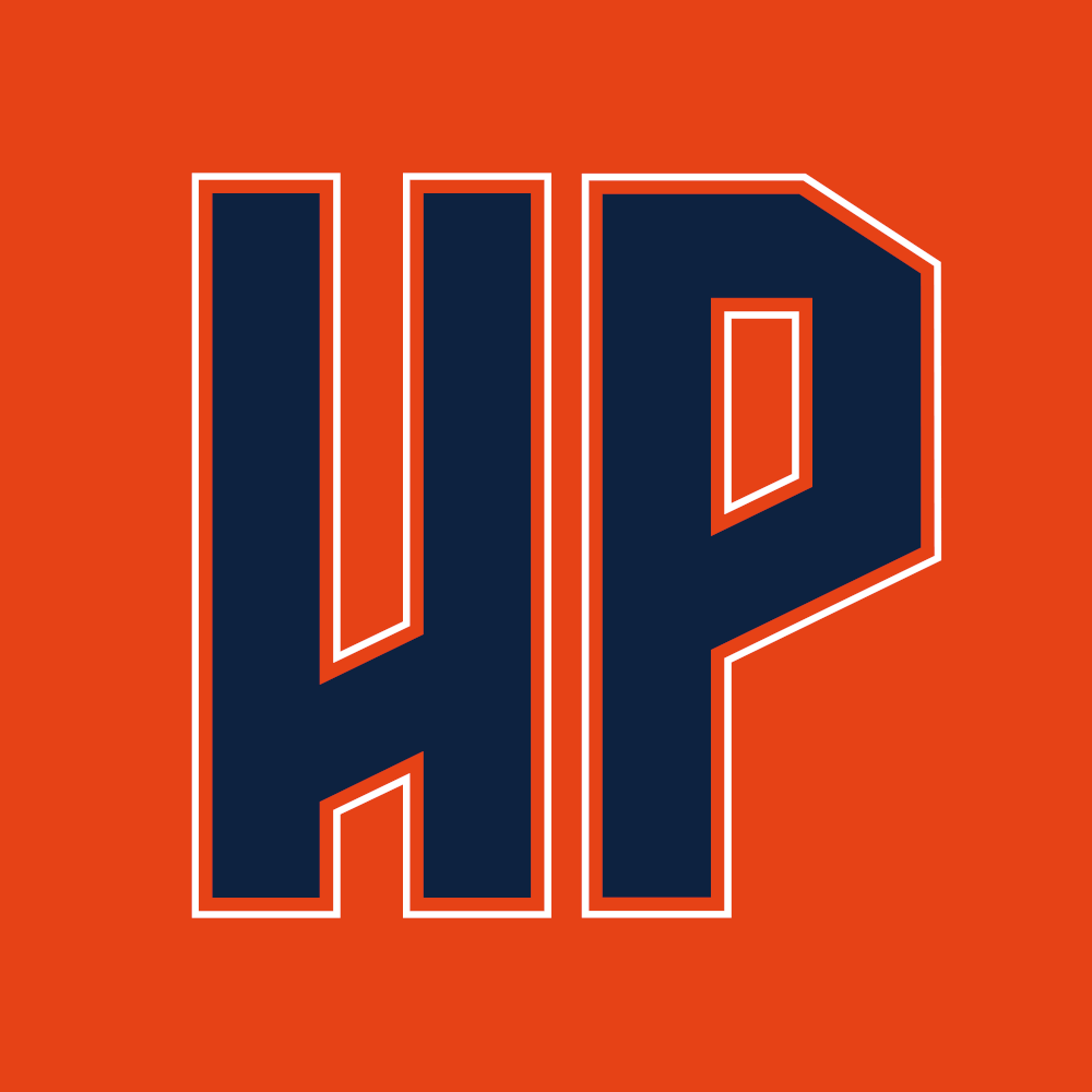
The new logo design focuses on the key element of what sets High Park Little League apart – the park itself – a unique location situated in Toronto, where people from surrounding communities congregate to relax, rejuvenate and cheer kids playing baseball. The main logo features the boundaries of High Park accentuated by new colours, Outta the Park Orange, Batter Up Blue, and Foul Line White.
“It was really important for us to create a design that not only honoured the club and the park’s history but rallied the community around this cherished shared space…a mark that everyone would be proud to display whether their child plays for the league or not,” says Marta Hooper, Creative Director at trevor//peter, who has two sons playing in the league.
The outfield sign in Ernie Keith field will be updated, as well as the Championship sign, which celebrates the four Canadian championships High Park has won since it first competed nationally in 1957 as one of the first Little League teams in Canada.